I led the design of AIQUA, Appier’s AI-powered personalization cloud platform, which enables businesses to deliver tailored customer experiences across multiple touchpoints.

AIQUA is Appier's personalization cloud, helping marketing teams across APAC turn customer data into targeted, multi-channel campaigns powered by AI.
(Lead designer from Jun 2018 to Mar 2025)
The core feature of AIQUA is enabling marketers to create and manage campaigns that communicate with their customers. However, after launching campaigns, marketers often spend significant time analyzing results. Campaign data is scattered across multiple dashboards, requiring them to manually gather metrics and interpret performance. This process is time-consuming and slows down their ability to focus on strategic decisions. Marketers need a more efficient way to access insights so they can spend less time compiling data and more time optimizing their campaigns.

User pain point 1
Lack of actionable insights
Data covered days, channels, and users. But none of it told marketers what to focus on next.
User pain point 2
No alignments with business objectives
Fixed chart types forced marketers to read data the platform's way, not their business's way.
User pain point 3
Repetitive manual efforts
When the platform couldn't flex, marketers worked around it: downloading reports and rebuilding charts in spreadsheets.

Expert research
What marketers actually needed to do
I reviewed the performance reports that Customer Success Managers (CSMs) had prepared for clients to communicate the impact of AIQUA campaigns. By analyzing these materials, I identified four key categories of analytics needs:
Regular reporting: Generate weekly, monthly, and quarterly performance overviews.
Campaign monitoring: Track campaign metrics and user behavior across channels.
User analysis: Identify key user segments and surface performance patterns.
Insight generation: Evaluate channel effectiveness, timing patterns, growth trends, and content performance.
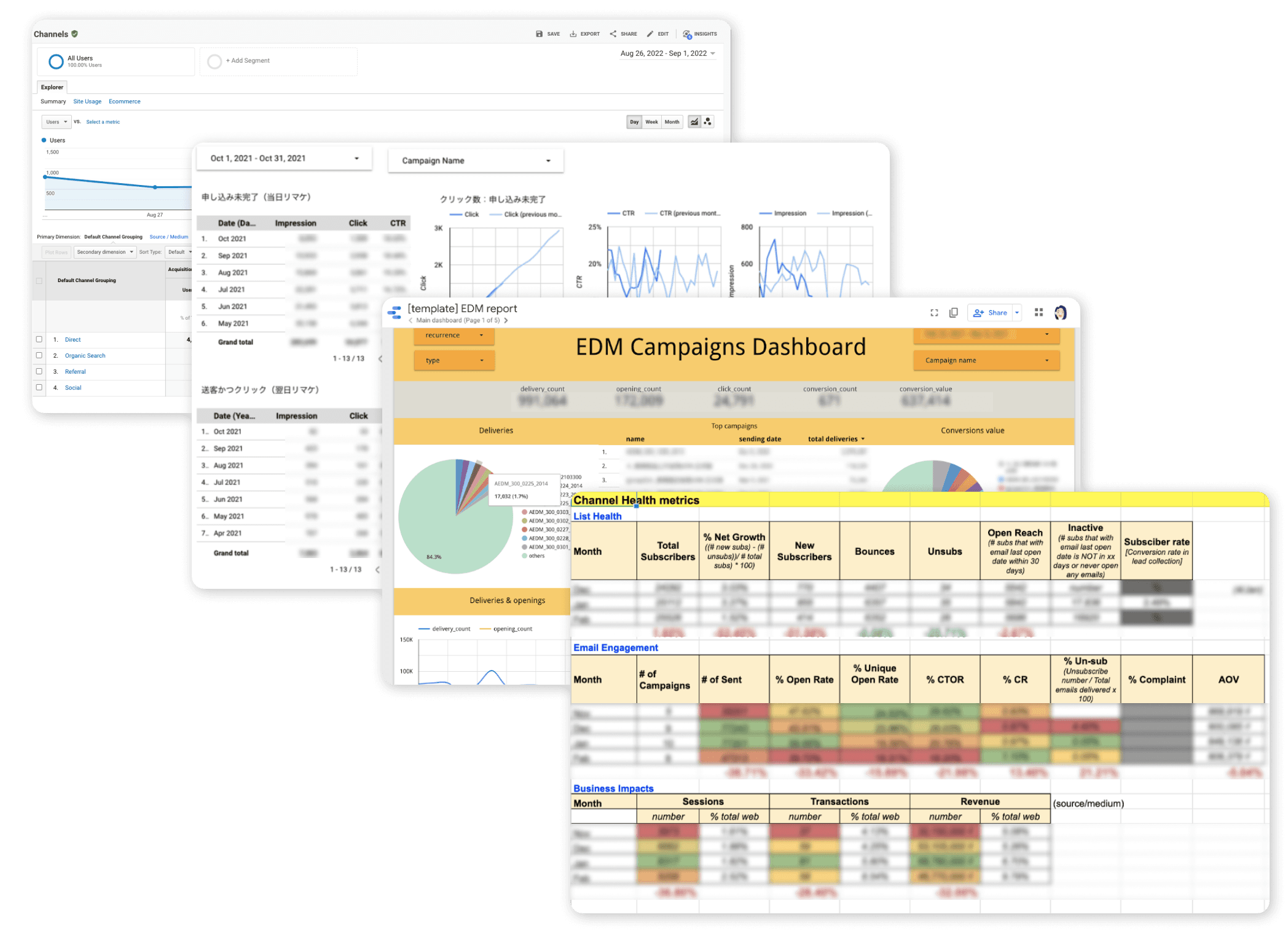
Co-creating the Dashboard with Customer Success Teams
In addition to reviewing existing materials, I organized a series of workshops with Customer Success Managers (CSMs) from different regions to brainstorm and co-create dashboard concepts. Client needs varied widely depending on factors such as business maturity, communication channels, company size, and internal workflows.
To translate these diverse requirements into a unified solution, the workshops focused on identifying common analytical priorities and designing a flexible dashboard framework that could adapt to different industries and regional needs. This collaborative process helped ensure the final design addressed real client use cases while remaining scalable across markets.

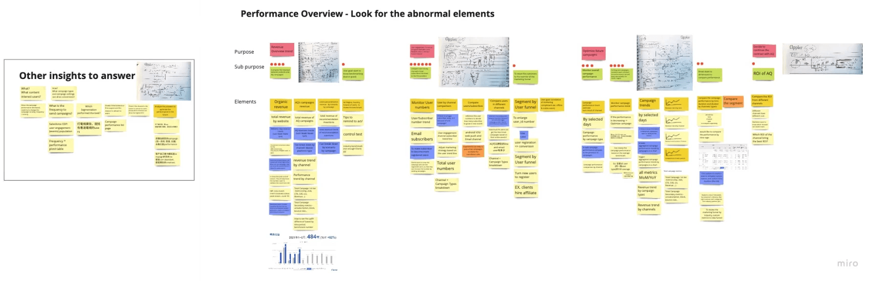


Competitor study
What marketers actually needed to do
I reviewed the performance reports that Customer Success Managers (CSMs) had prepared for clients to communicate the impact of AIQUA campaigns. By analyzing these materials, I identified four key categories of analytics needs:
Regular reporting: Generate weekly, monthly, and quarterly performance overviews.
Campaign monitoring: Track campaign metrics and user behavior across channels.
User analysis: Identify key user segments and surface performance patterns.
Insight generation: Evaluate channel effectiveness, timing patterns, growth trends, and content performance.
First proposal
Scenario-based chart creation: simpler onboarding, higher dev cost
The first proposal guided users through chart creation based on their marketing scenario. This made onboarding easier and gave clear, step-by-step instructions. The tradeoff: each scenario required custom data integration, which extended the development timeline significantly.

Design challenge 1
Design the chart system cross all Appier enterprise products' data structure
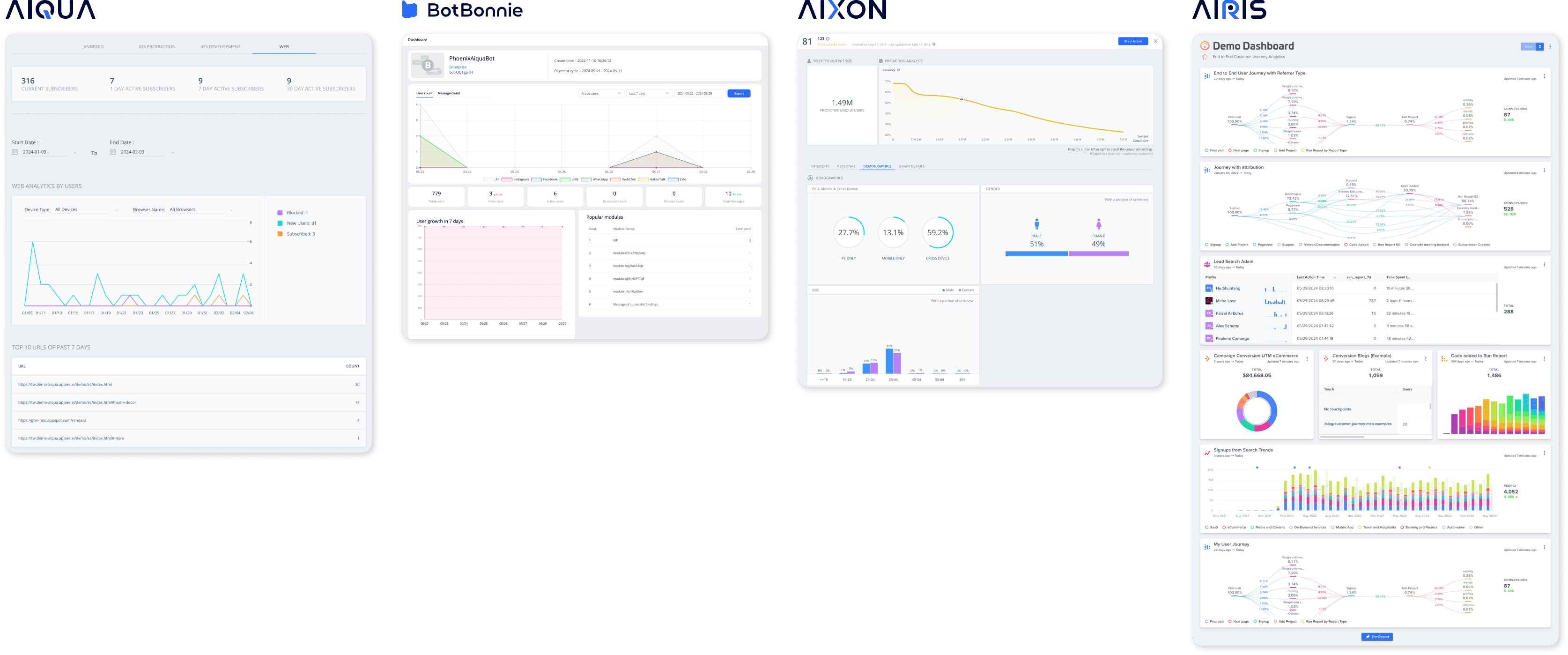
Design challenge 2
Ease of use vs. scalability: two configuration models
Two approaches to chart configuration. WYSIWYG maps data directly to X and Y axes, which is intuitive for beginners but breaks when users switch chart types. A dimension-and-metric model lets users define what to measure and how to group it, so the same configuration works across any chart type. The tradeoff is a steeper learning curve.
Configuration style
WYSIWYG (X and Y axes)
Dimensions and metrics
Advantages
Intuitive for beginners. Low learning curve.
Switch chart types without reconfiguring data. One setup, any visualization.
Disadvantages
Rigid axis mapping. Not all chart types are compatible, and switching types requires reconfiguration.
Users need basic understanding of data structure concepts.
In a WYSIWYG approach, it's simple to switch between similar chart types like line and bar charts. However, transitioning to more dissimilar chart types, such as pie charts or scorecards, can be more challenging due to the underlying data structure.

Design decision
Reviewing the product persona to decide the solution

Marketers struggling with digital transformation

ROI-driven marketing managers

Data-driven growth hackers

Multitasking SMB marketers
Why we chose dimensions and metrics over WYSIWYG
WYSIWYG was easier to learn but couldn't scale across products with different data structures. Dimensions and metrics required more from users upfront, but one configuration model could serve every chart type across all four product lines. The widget definition matrix documented every configuration option per chart type to align design and engineering on scope.

User research finding
Reviewing the product persona to decide the solution
Marketers struggling with digital transformation
ROI-driven marketing managers
Data-driven growth hackers
Multitasking SMB marketers
Why we chose dimensions and metrics over WYSIWYG
WYSIWYG was easier to learn but couldn't scale across products with different data structures. Dimensions and metrics required more from users upfront, but one configuration model could serve every chart type across all four product lines. The widget definition matrix documented every configuration option per chart type to align design and engineering on scope.
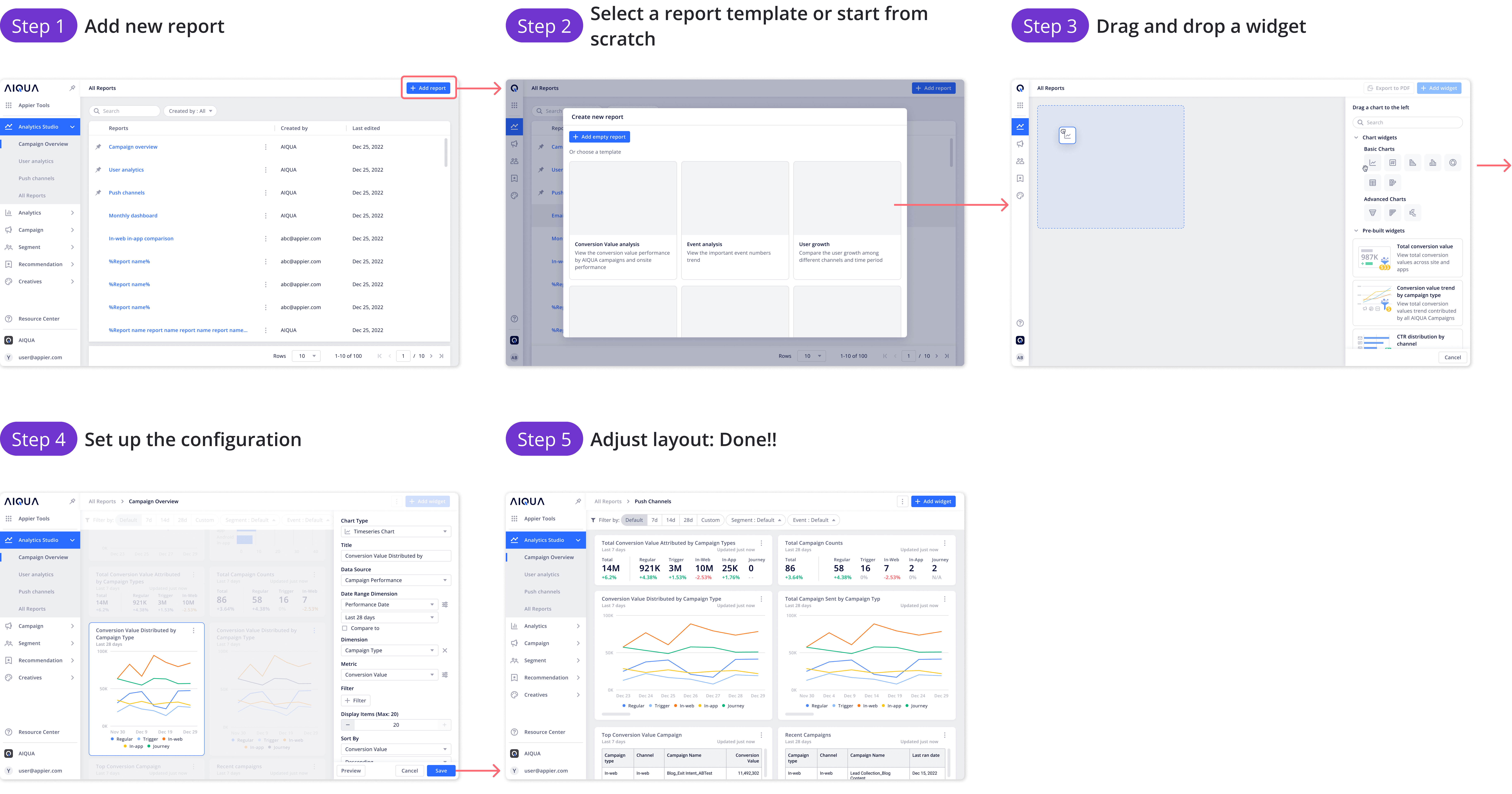
User flow design
Generate purpose-built reports in just five steps
Redesigned the user flow to provide report and widget templates that help marketers struggling with digital transformation and multitasking SMB marketers quickly create reports. At the same time, the flow enables ROI-driven marketing managers and data-driven growth hackers to build customized views using preconfigured data, allowing them to explore deeper business insights.
Design highlight 1
Switchable chart types enable marketers to explore data through various visualizations.
The Dimension & Metrics approach provides the flexibility to easily switch between chart representations without requiring significant reconfiguration.

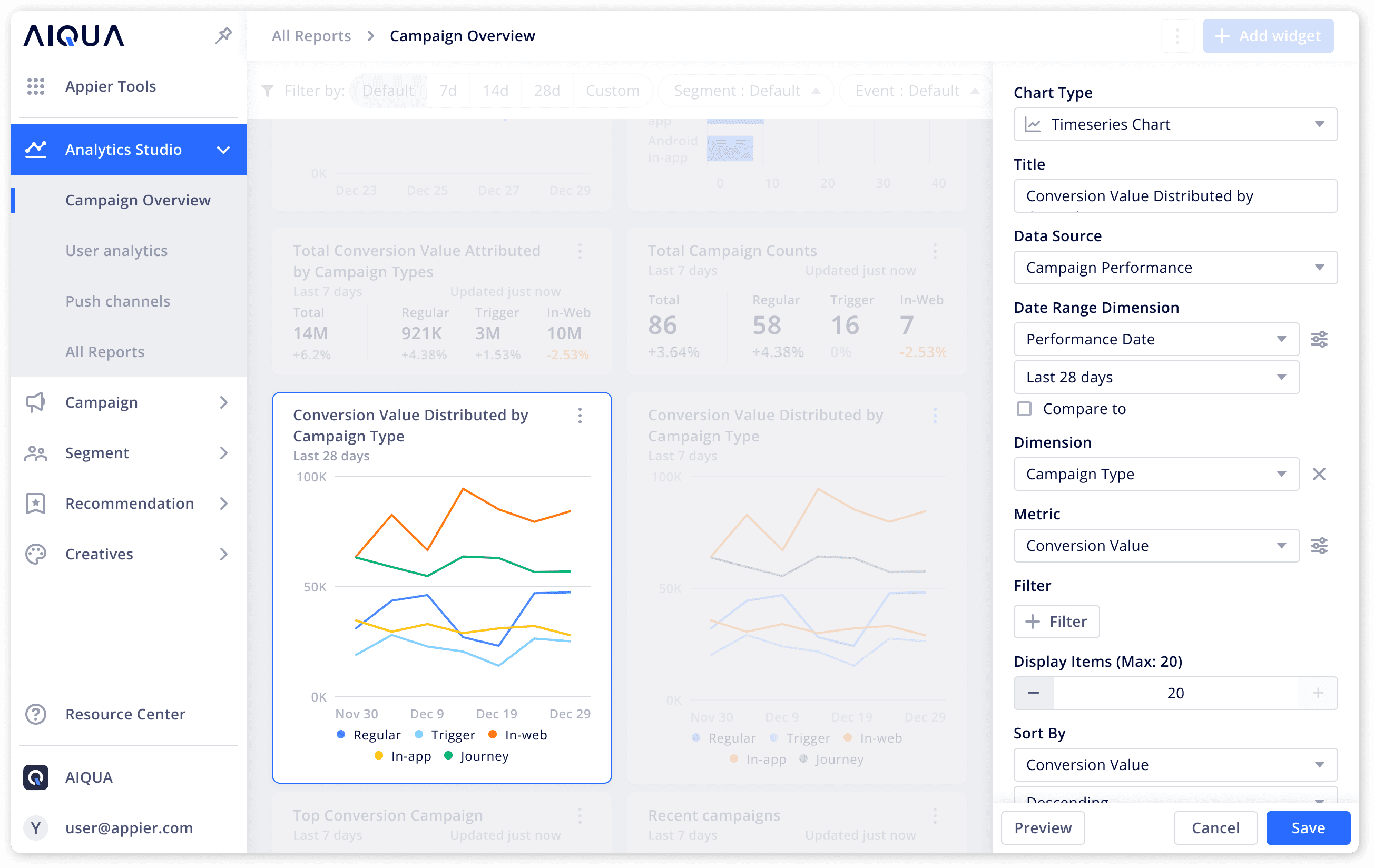
Different chart types support different analytical goals. Users can easily switch between chart formats and adjust configurations to transform the data and tailor the visualization to their needs.

Users configure charts using a guided toolkit that helps them build data views from scratch while allowing flexibility to tailor visualizations for specific purposes. For example, marketers who want to present the profit trend of campaigns can easily create a daily campaign line chart. If they want to break the results down by channel and compare performance, they can simply add a dimension to view the comparison directly in the chart.

Design highlight 2
Empowering marketers with flexible and customizable Reporting
Marketers can easily customize their dashboards by simply dragging and dropping desired widgets into place.

The main analytics report view offers a clean and flexible interface for visualizing data, empowering marketers with greater control over their insights.

Marketers can easily create custom dashboards by dragging and dropping widgets, adjusting both their size and position for optimal analysis.
Marketers can view reports while adjusting widget positions. At the same time, they can edit individual widgets directly on the same page, eliminating the need to navigate away.
Design highlight 3
Marketers can create custom pinned reports for use as daily dashboards.
For commonly or frequently used reports, marketers can simply pin them for quick access, allowing team members to monitor performance together.
Report templates provide marketers with a quick start in viewing reports without requiring full analysis knowledge.

Project impact
Empowering marketers with flexible, persona-driven analytics
Empowering 729 Active Users Across 108 Companies: Analytics Studio is giving marketers a powerful tool to dive deeper into their data, helping them make smarter, more effective decisions about their marketing strategies.
Simplifying Weekly and Monthly Reviews: Marketers can now build custom dashboards to easily track key performance indicators (KPIs), making their weekly and monthly business reviews much faster and more efficient.
Boosting Productivity and Efficiency: By removing the need to download data and manually create reports, Analytics Studio lets marketers focus on more strategic tasks, like developing fresh campaign ideas and spotting new growth opportunities.
Enabling Data-Driven Decisions: With real-time, actionable insights at their fingertips, marketers can make smarter decisions, improving campaign results, driving better ROI, and contributing to the overall success of the business.
Creating a Data-Driven Culture: Analytics Studio is helping to create a data-driven mindset across these 108 companies, giving marketers the tools they need to take a more data-centric approach to their work.
Reflection
Reflecting on Design: Personas, Product Thinking, and Flow Optimization
Prioritize user personas in design decisions: Continuously reviewing and referencing our key marketer personas. In this case, ranging from those struggling with digital transformation to data-driven growth hackers may result in different design solutions. Ensured that every dashboard feature, chart type, and report template addressed real user needs and workflows. This approach helped balance simplicity for less experienced users while providing flexibility for advanced users.
Think like a product manager to connect the dots: Designing Analytics Studio required connecting multiple products and features across the enterprise ecosystem, including Customer Data Platform, Chatbot services, and segmentation tools. Approaching the work with a product mindset helped ensure consistency, scalability, and a unified analytics experience for all users, rather than isolated features.
Constantly refine workflows for smoother experiences: I challenged myself to identify friction points and iteratively improve flows, from chart creation to dashboard customization, enabling users to explore and act on their data more intuitively. This focus on flow optimization directly improved efficiency and user satisfaction.

Diane Lee
Updated Mar, 2026