Unified Campaign Experience:
One Redesign to Fix Years of Accumulated Friction
Turning accumulated usability debt into a coherent, end-to-end campaign experience.
2021 Oct to 2022 Feb
Feature requests and usability complaints had been piling up for years. Marketers using AIQUA were powerful users doing complex work — running multi-channel campaigns, designing experiments, analyzing performance — but the product was making each of those jobs harder than it needed to be.
There was no single, clear place to understand what a campaign was doing. Creation was repetitive. Filters were hard to find. Performance data had no context. And the management table — the screen marketers lived in every day — was dense, static, and slow.
Rather than patch individual issues, we took the opportunity to redesign the entire campaign lifecycle from creation through performance analysis. This is what happens when you treat usability debt as a product strategy problem.

AIQUA is Appier's personalization cloud, helping marketing teams across APAC turn customer data into targeted, multi-channel campaigns powered by AI.
(Lead designer from Jun 2018 to Mar 2025)

Chapter 01
Campaign Creation
Marketers begin their journey by creating campaigns to communicate with their customers.

Pain point 1
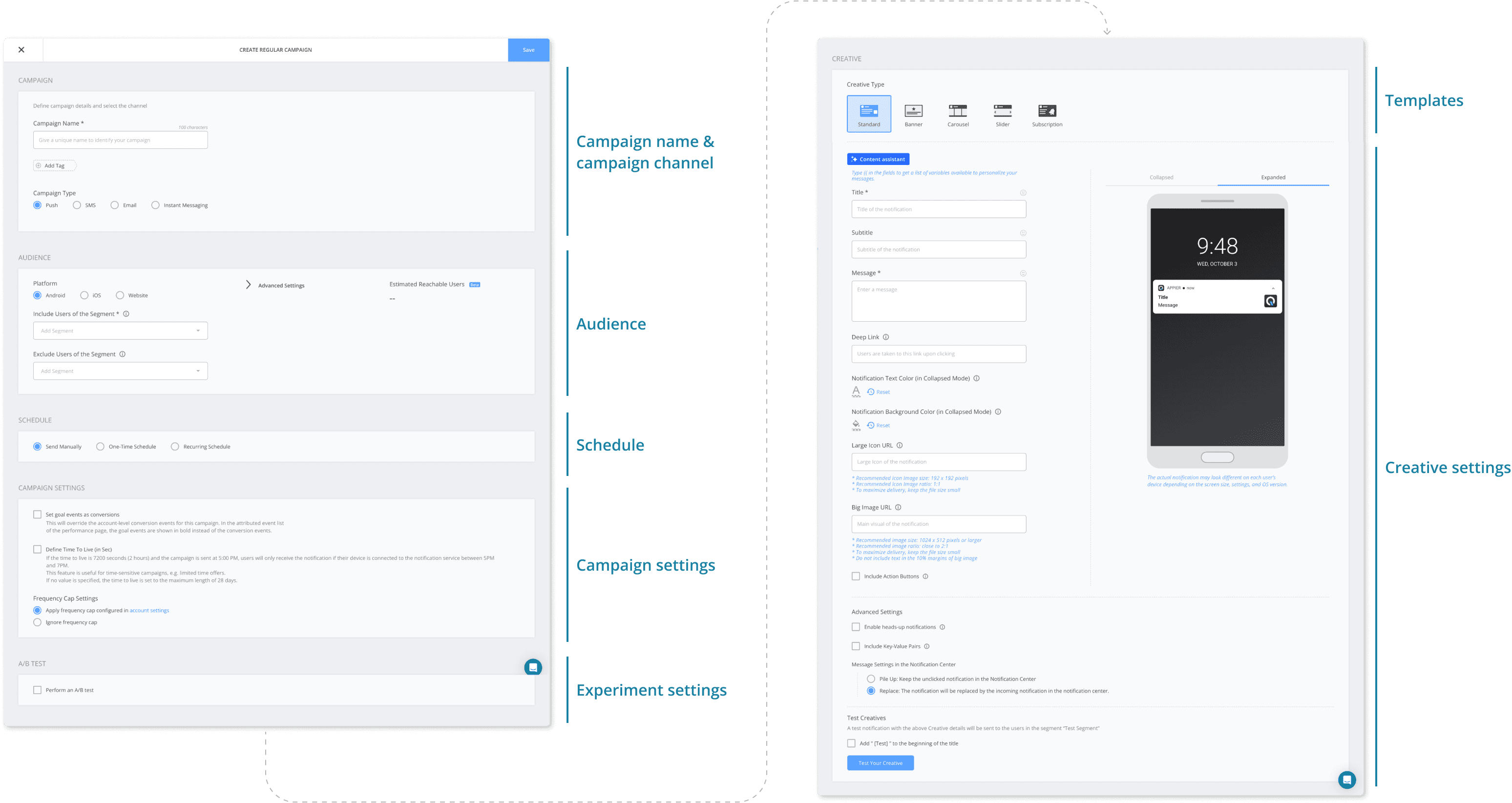
Marketers were rebuilding the same campaign three times — once for Android, once for iOS, once for web. Not because they wanted to. Because the product required it.

Pain point 2
One-page campaign creation lead the cognitive overload and increased error rates
Pain point 3
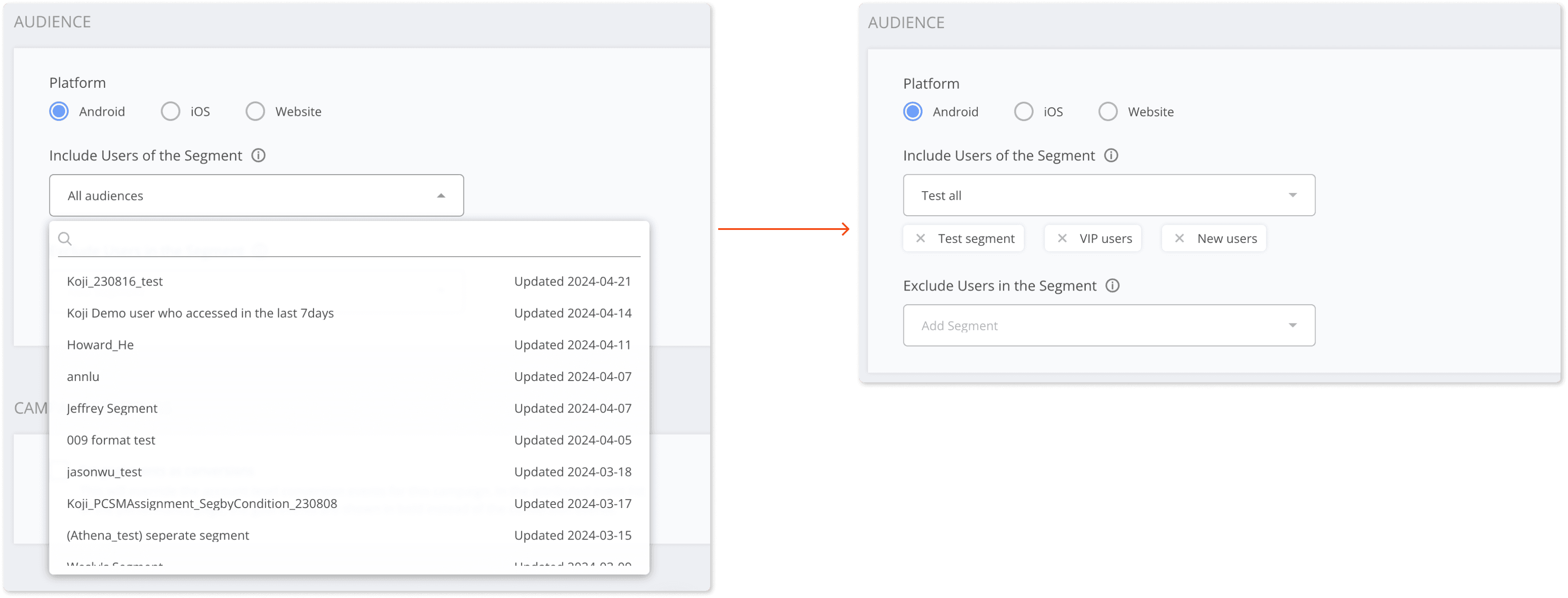
Audience Selection Usability Issues
Design solution
Enhanced campaign creation & audience selection
Step-by-step campaign creation: Breaking the campaign creation process into smaller, sequential steps helps present information in manageable chunks, reducing cognitive load and guiding users through the workflow more clearly.
Multi-channel campaign setup: Allowing independent channel selection across multiple platforms enables marketers to configure campaigns for different channels in one place, eliminating redundant setup and improving efficiency.
Simplified audience selection: Improvements include a pre-selected “All Audience” option for common use cases, visible selected segments for quick review, and clear guidance on segment limits—creating a smoother and more transparent workflow.

Optimized content settings step
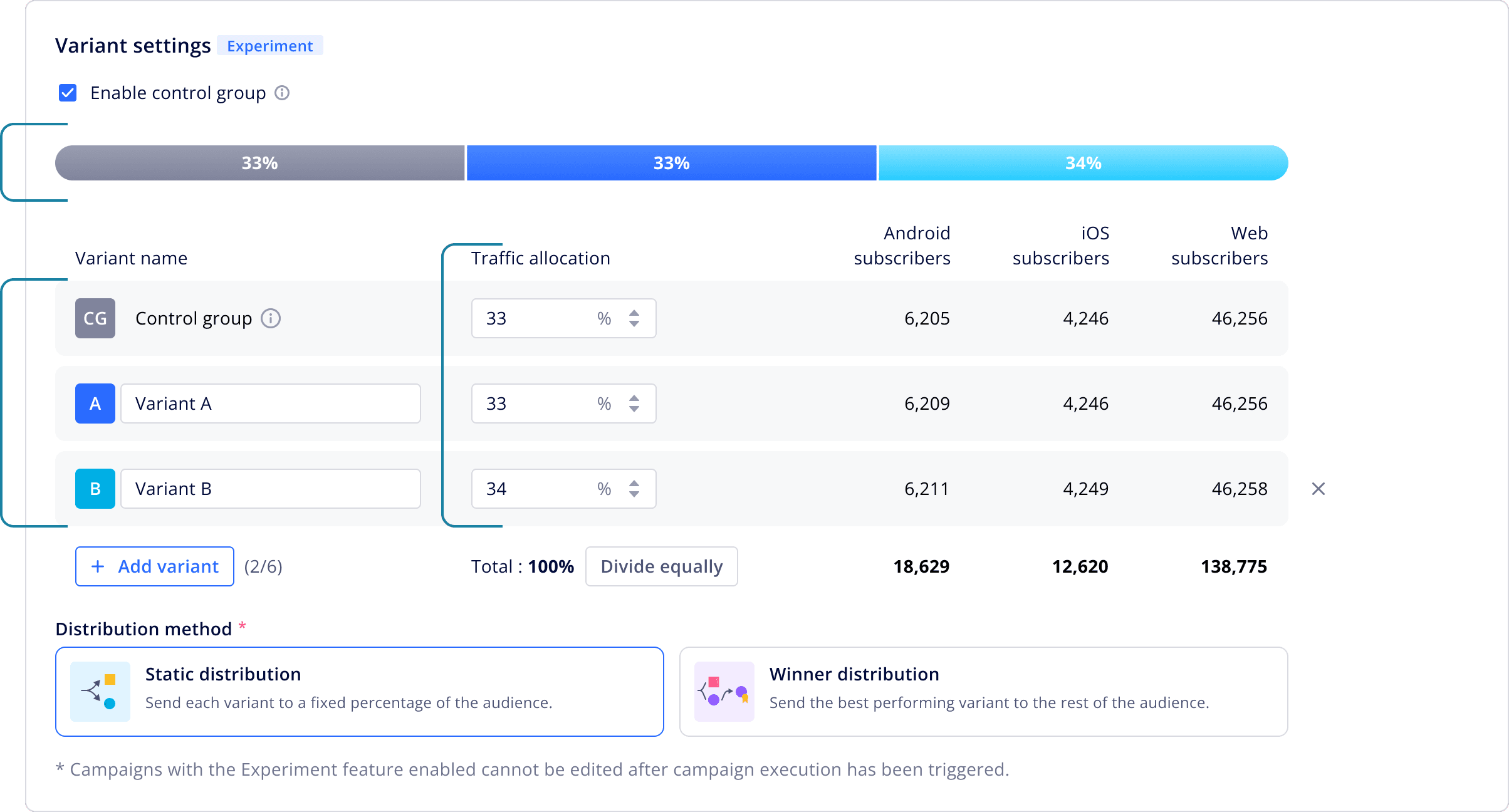
Experiment settings: Variant settings are displayed to encourage marketers to conduct experiments and optimize campaign performance
Multi-channel content: Content can be simultaneously entered for all three channels, eliminating redundant input.
Advanced settings: Marketers can still customize creatives for individual channels when needed.

Enhanced visualization
Traffic allocation indicator: Displays variant percentages with color-coded segments.
Variants with tags: To enhance clarity, marketers can name variants, with icons providing visual indicators of each variant.
Traffic allocation input: To better meet marketer needs identified in user interviews, we designed input areas for direct numerical specification of variant distribution, instead of using allocation controls.
Optimizing winner distribution
From a purely technical perspective, distribution method selection should precede traffic allocation settings. However, our user research revealed that placing this decision later in the flow better aligns with marketers' mental models and decision sequence when designing experiments.

Schedule Configuration & Pre-Launch Verification
The final workflow stages provide marketers with intuitive scheduling controls and a comprehensive review page that consolidates all campaign elements for verification before launch, significantly reducing configuration errors and boosting deployment confidence.

Chapter 02
Review Performance
After creating campaigns, marketers closely review the performance page to gain insights and optimize future campaigns.

Pain point
The data was there. The insight wasn't.

Design solution 1
A experiment performance view built for decisions, not just reporting
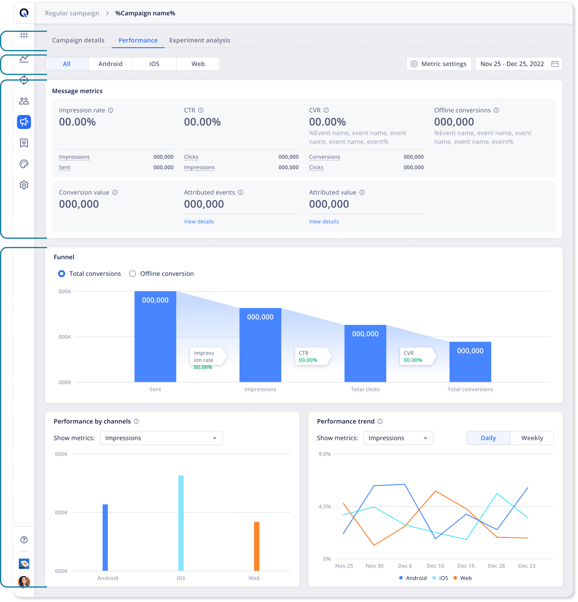
Campaign detail reference: Unified information architecture enables seamless navigation between performance metrics and configuration details, eliminating context switching and reducing analysis time.
Cross-channel analysis: Multi-dimensional channel analysis presents platform-specific performance data with synchronized visualizations, enabling immediate identification of high-performing channels and cross-platform optimization opportunities.
Integrated metrics framework: Cohesive metrics visualization system reveals cause-and-effect relationships between engagement touchpoints, conversion actions, and business outcomes, transforming isolated data points into actionable strategic insights.
Comprehensive visualization system: Multi-modal data storytelling framework combines funnel analytics, comparative channel performance, and temporal trend analysis to reveal the complete customer journey from impression to conversion.
Design solution 2
From isolated numbers to connected insight
Campaign uplift comparison: Shows performance against the control group with clear percentage improvements. Designed to help marketers quickly identify which variants are driving higher conversion rates and ROI.
Variant comparison metrics: Consolidated view of key performance indicators across all test variants. Enables marketers to identify winning strategies based on CTR, conversion rates, and engagement metrics for data-driven decision making.
Interactive trend visualization: Displays performance evolution over time with customizable metrics and date ranges. Allows marketers to identify patterns, optimize campaign timing, and understand long-term impact of different strategies.

Chapter 03
Campaign Management
As the number of campaigns grows and companies begin assigning multiple marketers to manage them, there is a greater need for a campaign management system that is easier to navigate and operate.

Pain point
Barriers to Efficiency: UX Issues Slowing Down Users

Design solution 1
More control, more clarity, 21% more on screen
Clear status visualization: Improves visibility of campaign states, enabling faster decision-making and reducing operational errors.
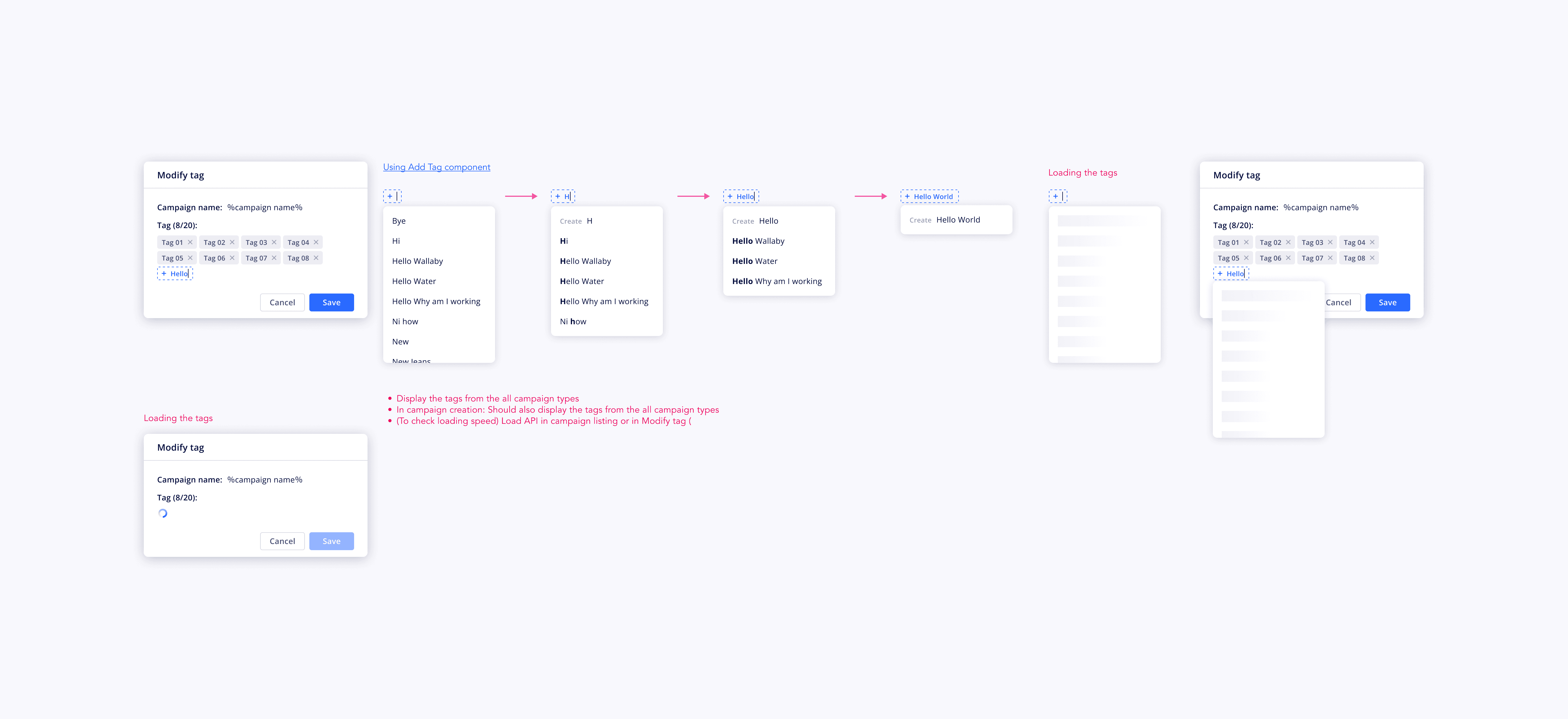
Accessible filtering and tagging system: A more discoverable filtering system reduces time to complete tasks, while customizable tags support personalized workflows and better campaign organization.
Date range performance analysis: Adding a date range selector allows marketers to easily calculate and review performance for specific periods, streamlining weekly and monthly reporting.
Optimized data-dense layout: A redesigned layout presents 21% more information within the same viewport while maintaining visual clarity, improving monitoring and campaign management efficiency.

Design system: Campaign filtering, date range and tagging system
Redesigned campaign filtering system with clear status indicators, intuitive date selection and tag management improved discoverability, task efficiency, and data clarity for campaign management workflows.


Design solution 2
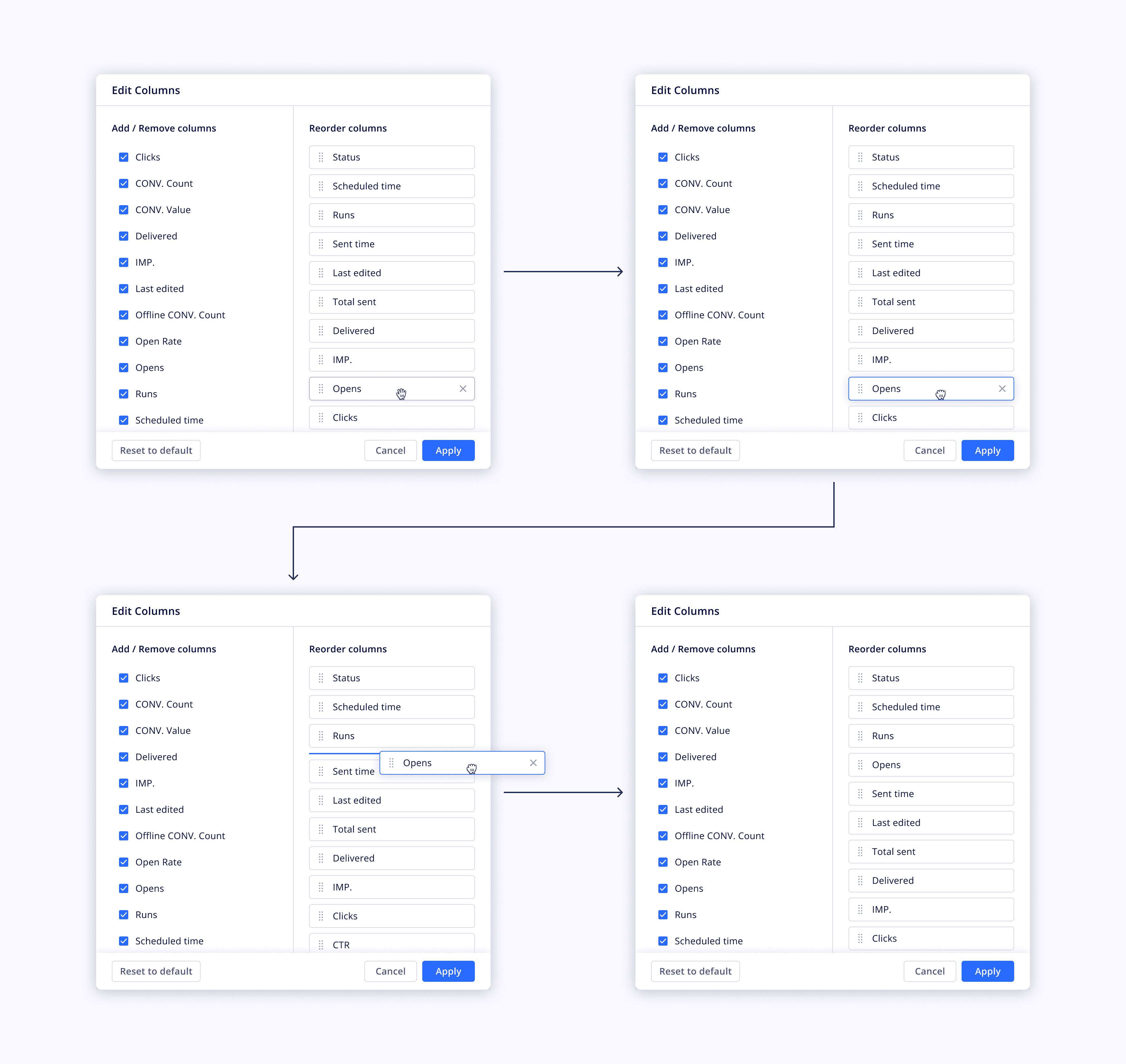
Custom table columns
Our user research revealed significant variations in how different marketing teams prioritize campaign metrics. We implemented a flexible column management system that enables users personalize data visibility based on individual role requirements. The implementation leverages drag-and-drop functionality with persistent user preferences, ensuring a seamless, intuitive experience that adapts to evolving analytical needs.
Design solution 3
Enhanced experience of search, filter, select and pagination behaviors
The combinations of the each controls lead the different experiences. To ensure the correct destination, I created this table to illustrate the refined behavior based on the users’ end to end intention.

Design output
End-to-end campaign experience: from creation to management
After multiple rounds of design validation and visual refinement, we finalized a redesigned end-to-end campaign experience spanning creation, performance analysis, and management.
Reflection
Designing a unified campaign system that drives measurable impact
This project highlighted the importance of cross-functional collaboration and system thinking in delivering a cohesive user experience. By working closely with product managers and engineers, I established a unified interaction guideline that maintained consistency while adapting to the distinct needs of campaign creation, management, and analysis across products. Through iterative prototyping and extensive usability testing with power users, we continuously refined the experience based on real feedback.
Reimagining the workflow led to meaningful impact: transforming campaign creation from a single-page form into an intuitive 3-step process reduced creation time by 67% and errors by 65%. On the management side, introducing customizable views with tagging and bulk editing improved efficiency for teams handling multiple campaigns. For performance analysis, embedding contextual metrics and actionable insights directly into the interface helped marketers make faster decisions, ultimately increasing campaign performance by 28%.
This experience reinforced my approach to designing not just features, but end-to-end systems that drive measurable user and business outcomes.

Diane Lee
Updated Mar, 2026